City of Oakland
Agency
Objective Subject
Design Team
David Jalbert-Gagnier
Jesse Ragan
Jesse Ragan
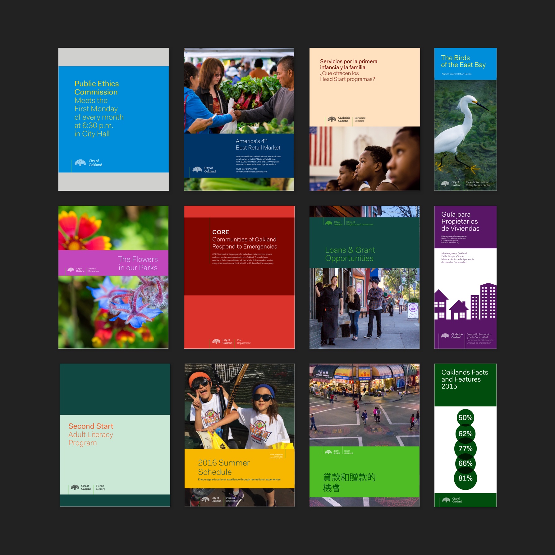
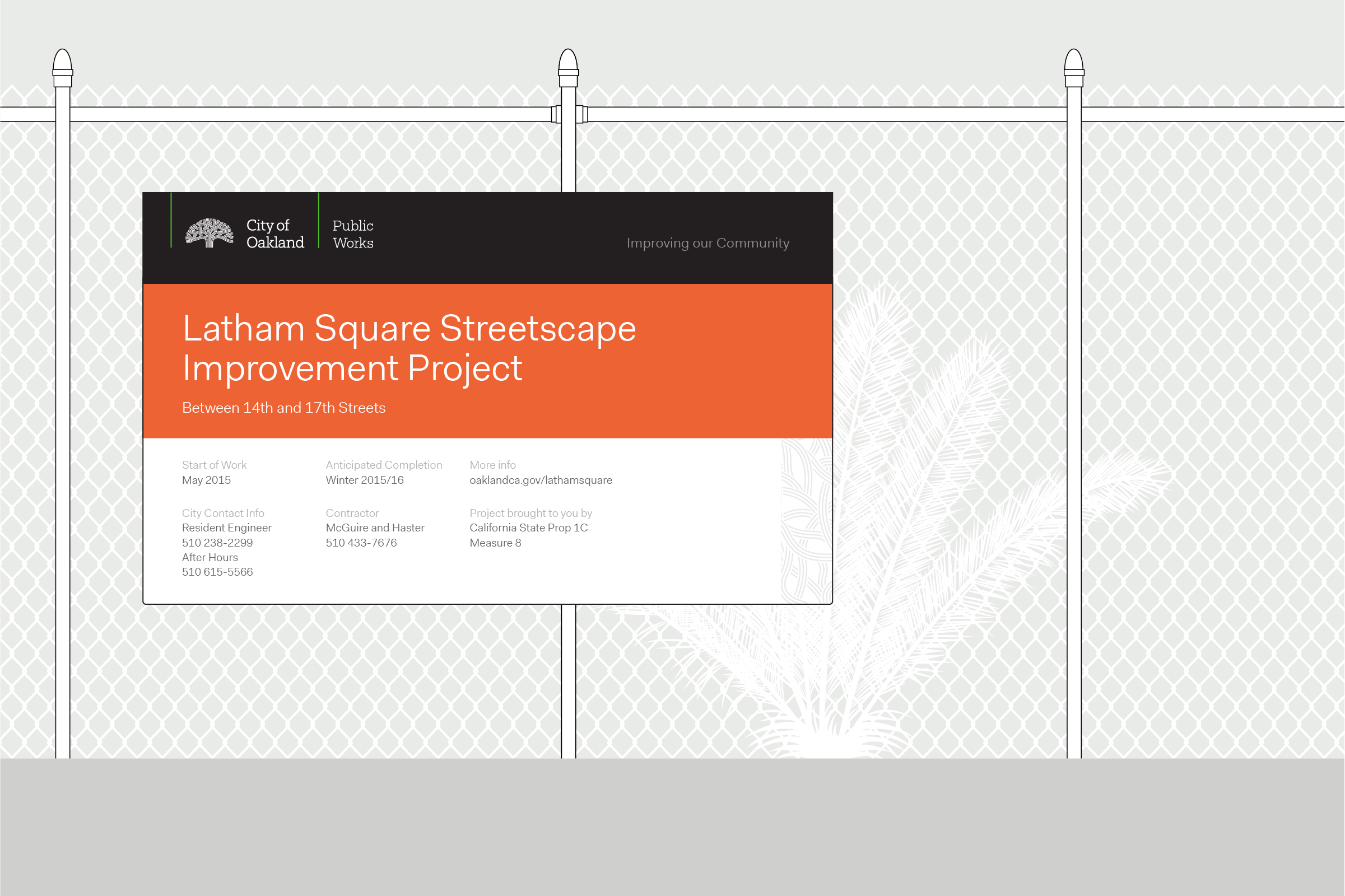
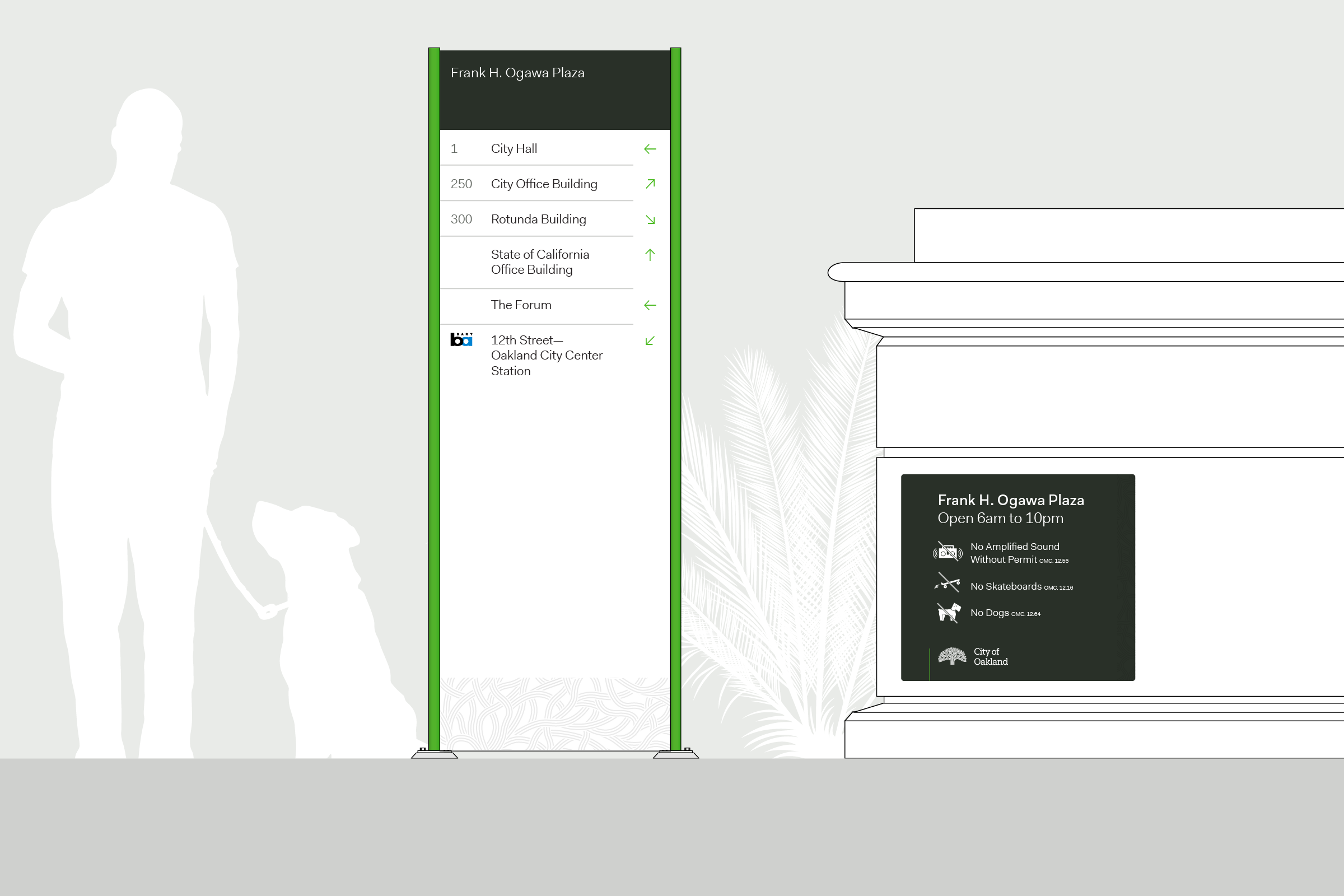
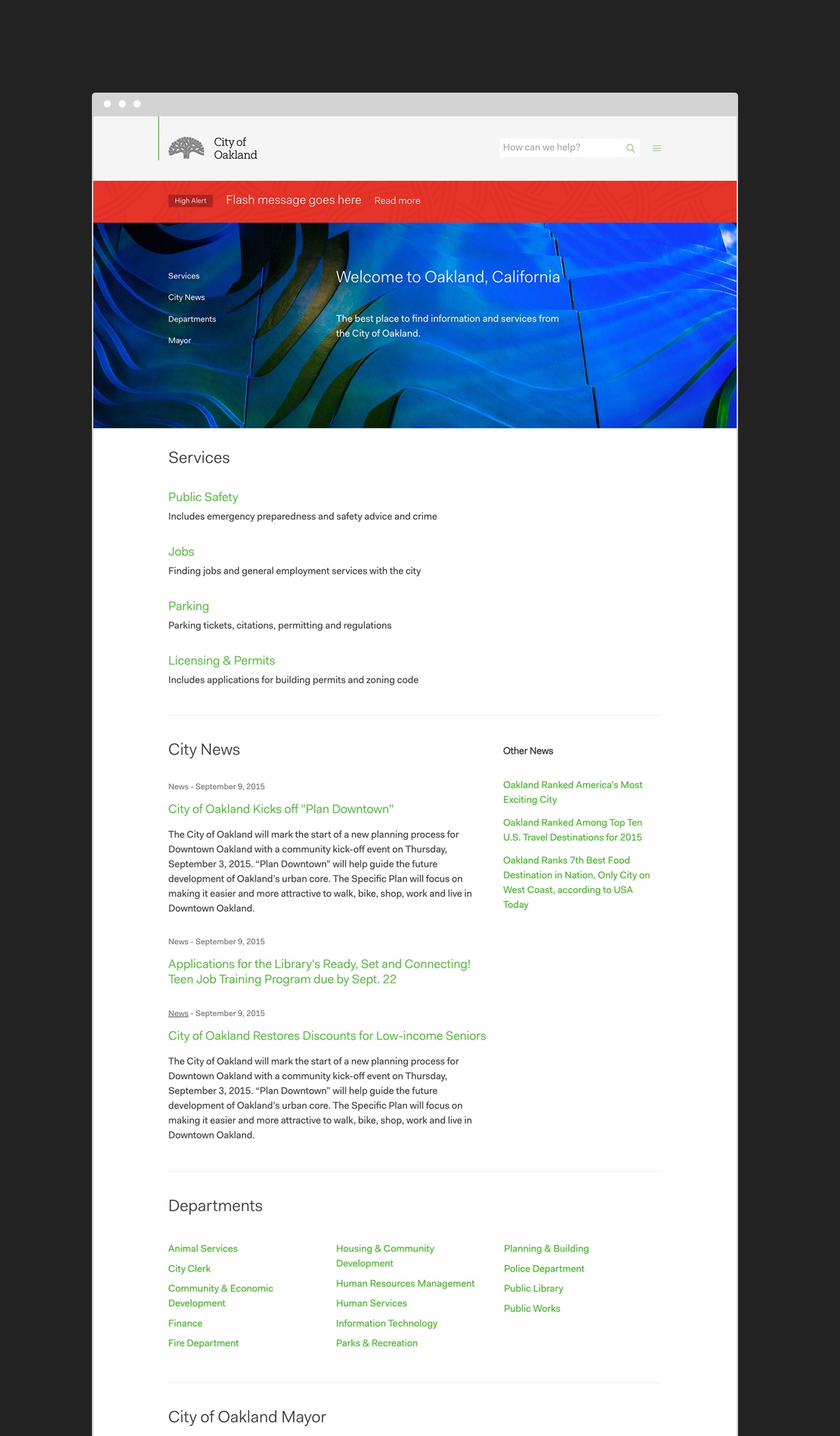
Oakland, California is a rapidly changing city known for its diverse and dynamic community. For decades, a stylized oak tree has represented the city and its intertwined citizenry.
Immersed in the city’s archives, we conducted in-depth research and visual audits, discovering iterations of the symbol tracing back to 1970’s. Throughout the symbols history, only minor tweaks had been made, preserving the intertwined beauty of the tree. Working with type designer Jesse Ragan, we refined symbol to create a better optical legibility for screens and small sizes.
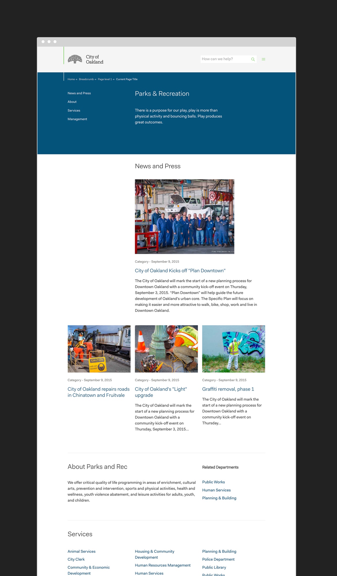
An entire visual identity overhaul now allows the government to better communicate its offering to its residents.